Bare
Designing a color-changing sunscreen packaging that helps to prevent sunburn
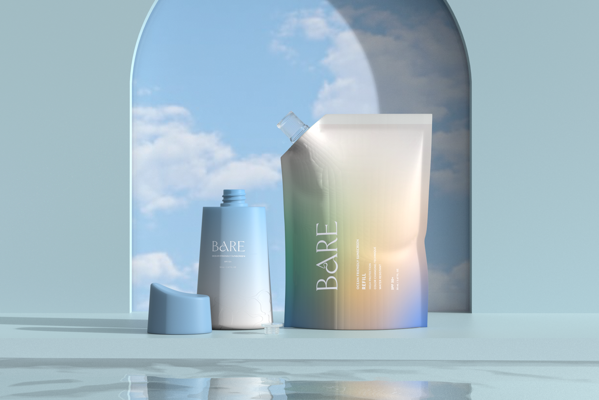
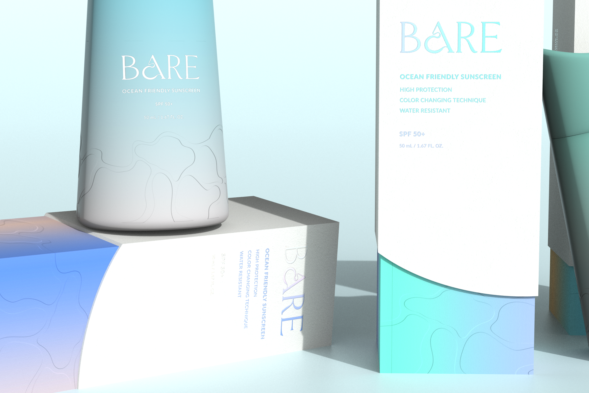
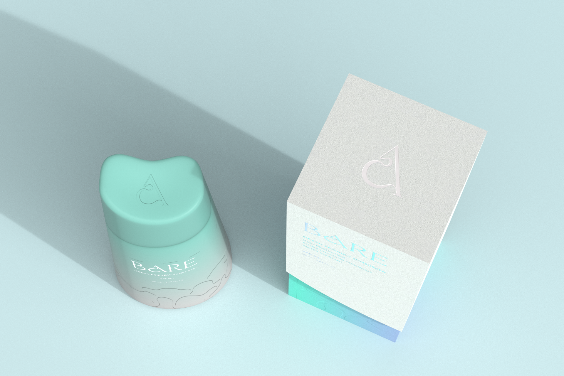
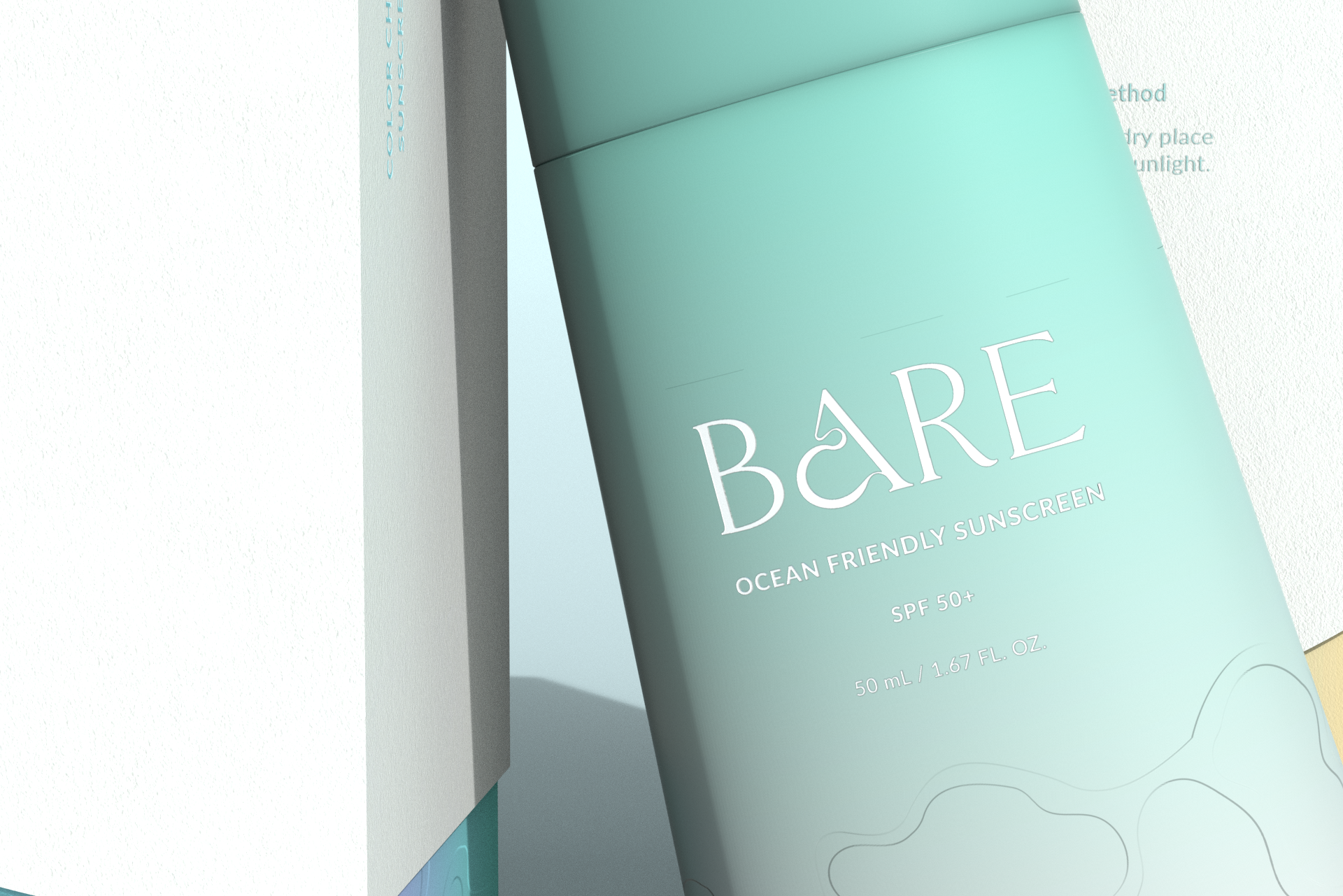
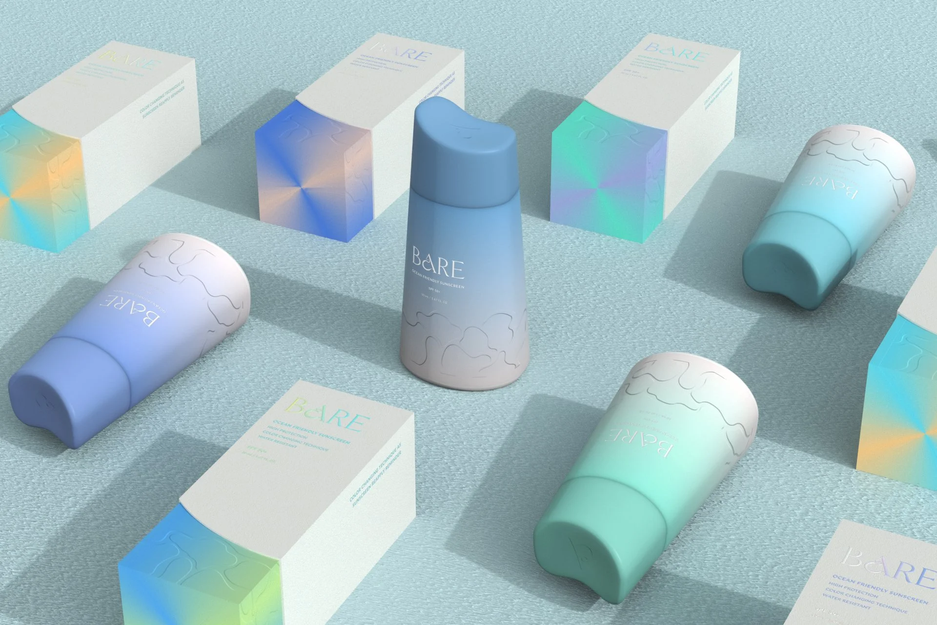
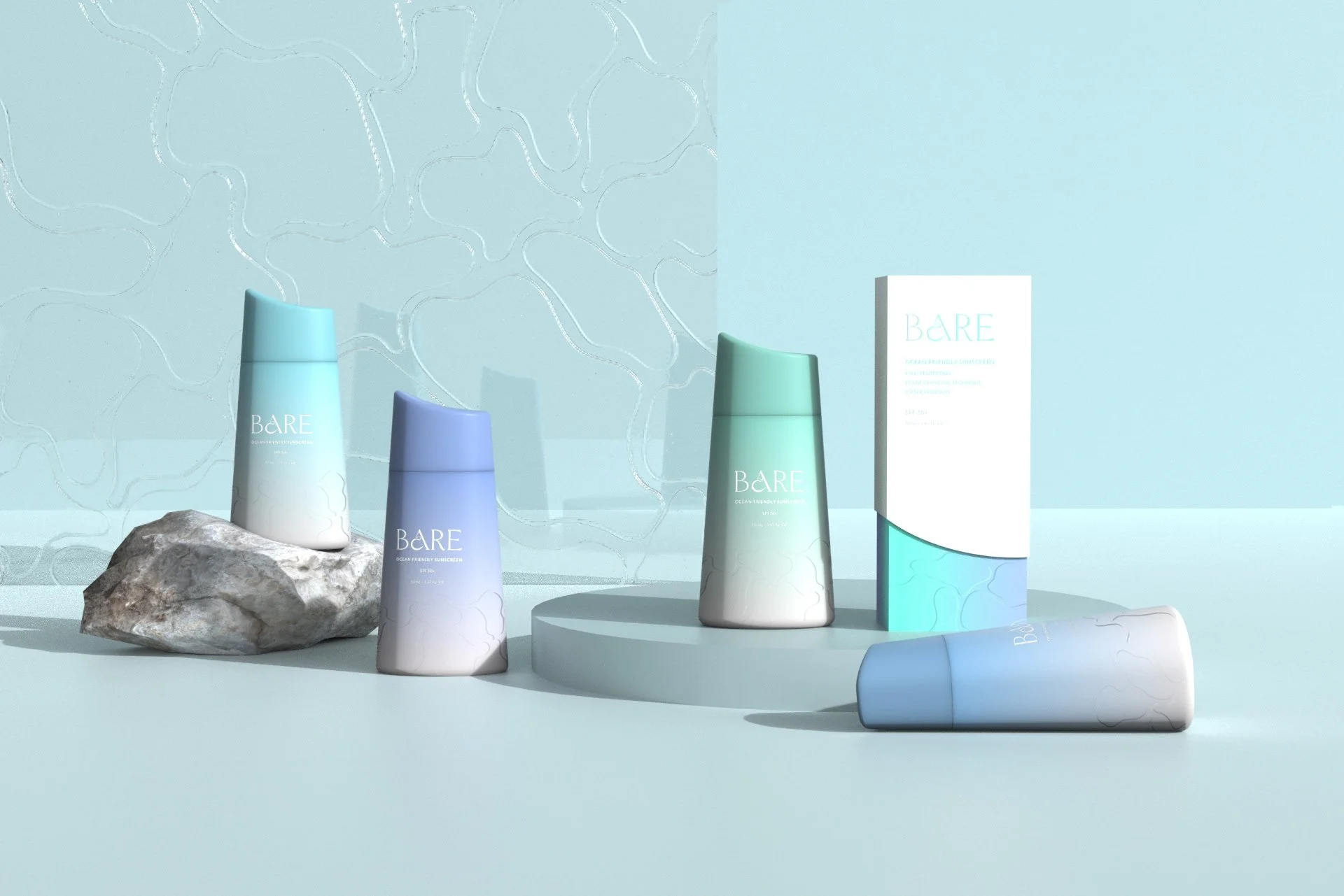
BARE is an organic suncare brand, that keeps with its devotion to clean, natural, and environmentally friendly beauty. The product uses recycled photochromic plastics to help remind people to reapply sunscreen to prevent sunburn with packaging that changes color when environmental UV light exposure changes.
Masters coursework in Packaging Design, Pratt
Brand Identity
Packaging
2021
Brand Identity / Art Direction
The name of the logo, BARE, interprets the brand philosophy to be 100% all nature in terms of materials and ingredients included in its sunscreen and packaging.
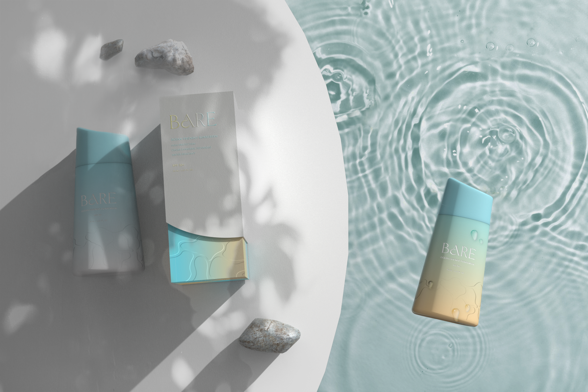
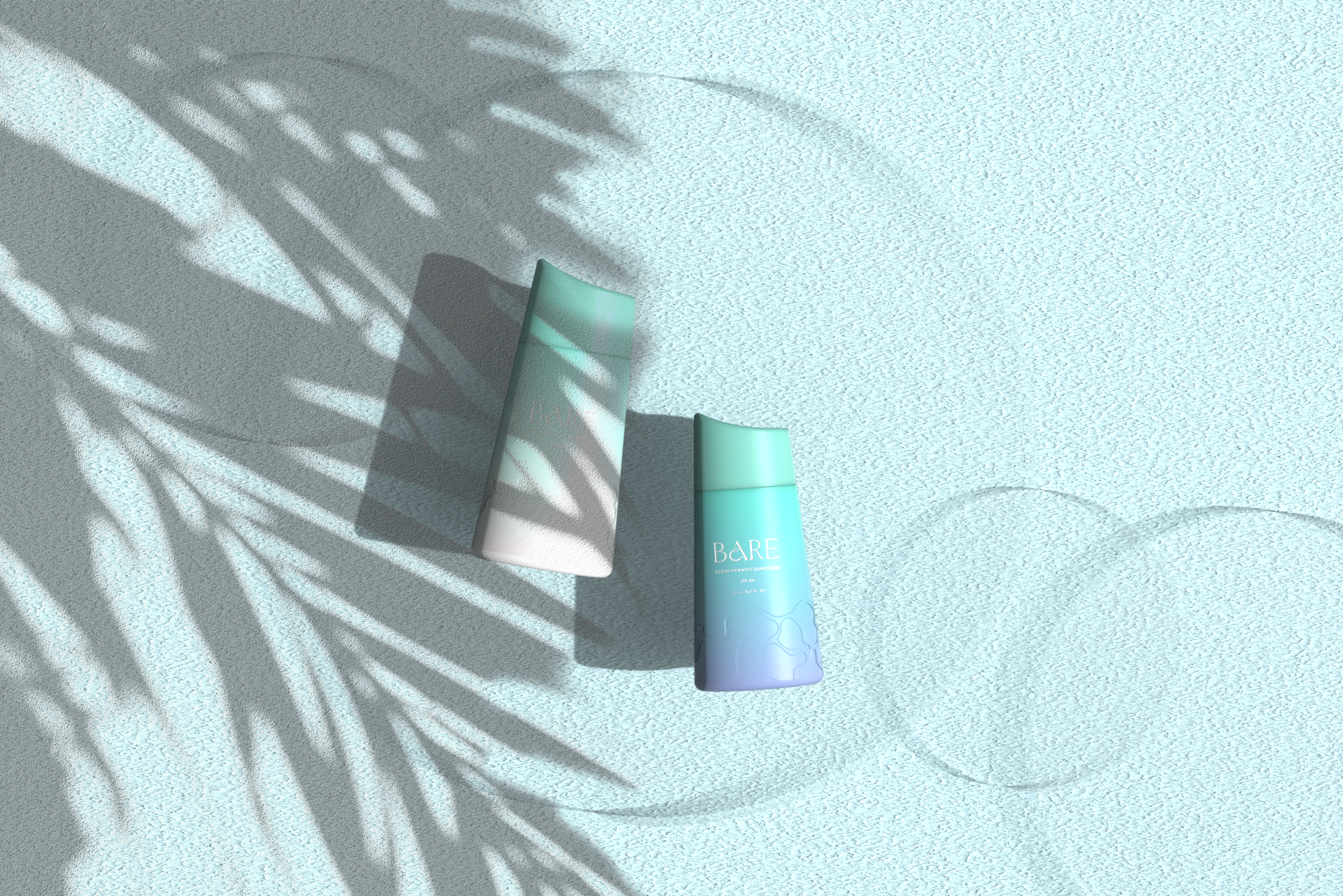
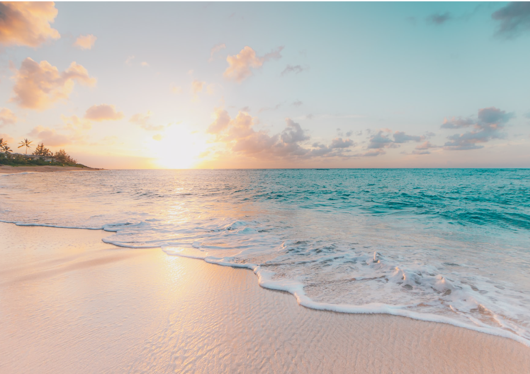
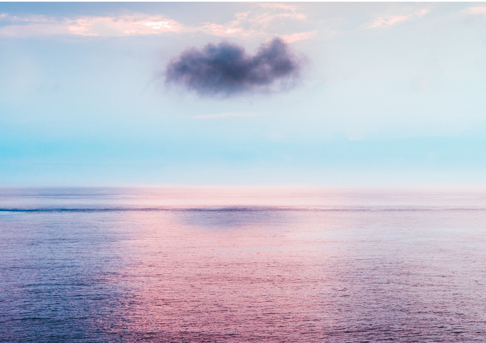
The brand is ocean-inspired and such characteristics reflect in the use of gradient colors and wavy patterns debossed on the bottle.
Color Palette
The ocean-inspired sunscreen is offered in 4 attractive pastel gradient shades, interpreting the ocean comes in various shades of blue at different times of the day and ocean scene, from sunrise to sunset, above the sea to under it. The color change is activated by UV light. When sunscreen bottles are exposed to the sun, one side of the linear gradient transition would change from one color to another.
Gradient 1: UNDER THE SEA

Gradient 2: DANCING W/ SAND

Gradient 3: ISLAND PARADISE


Gradient 4: SUNKISS GOODBYE

Sustainability